Top 10 web design trends you need to be aware of in 2019

Disclosure: This article may contain affiliate links. If you decide to make a purchase using one of these links, I’ll make a small commission without impacting the price that you will pay. I recommend just services or products I find useful and that I have tested or currently use.
Will web design continue the full acceleration towards entirely interactive experiences, or will designers slow down a bit? Check these top 2019 web design trends you need to be aware of this year.
Web is a fast growth space. Year over year, we see new technologies and development techniques, which allow much more freedom and creativity in terms of designing interfaces and interactions. In this space that has become more competitive than ever, the designers continue to evolve and keep up with the design trends, in their persistence to create remarkable and modern websites.
Speaking about trends, we should keep in our minds that all of them are influenced by different industries, such as art, fashion, media, technologies and cultures.

Moreover, this is a never-ending process, as long as they don’t emerge suddenly or disappear to nowhere. But it takes some time to peak, change their forms, eventually become overused and be replaced by other trends.
Minimalism, responsiveness, microinteractions or custom illustrations are not new. But they will continue to maintain their popularity in 2019.
And, while the mobile internet has an accelerated growth, designers will likely focus on interface aesthetics and mobile-first principles.
What other specific web design trends will shape 2019? Let’s have a look!
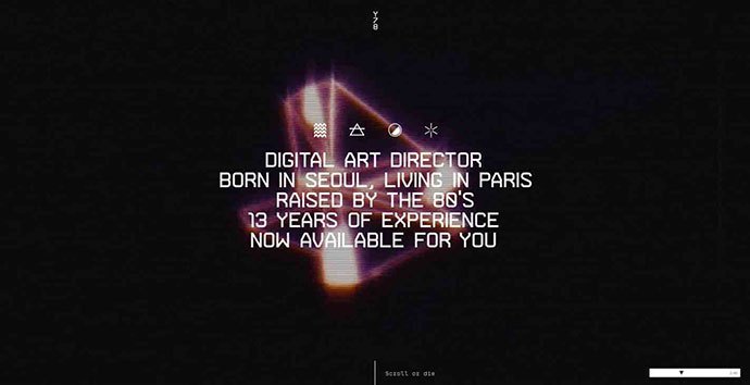
Bright, bold colors and gradients
In 2018, we saw a lot of colors in graphic design, and this trend is here to stay. And where should it manifest its full potential, if not in web design?
As the computer screens can deliver vibrant, saturated colors more than the other media channels, colors are one of the most powerful communication tools.
Brands use colors not just for transmitting their message, but also for differentiating themselves from the competitors. Therefore, taking the right chromatic choices can be the secret weapon for having engaged visitors instead of a high bounce rate.
Even if, traditionally, the bright, bold and vivid colors are used in flat design or semi-flat layouts, don’t be surprised when you’ll find them mixed with some other popular web design trends in 2019. When mixed with custom illustration designs, asymmetric layouts, floating elements, animated scroll you can get amazing visuals.

Source: LEPETITNANTAIS

Source: SlowBanana
In addition, gradients and deep, muted pastels will also be popular. In fact, the gradients have been a trend for so long, that they became almost a standard.
In 2018 we saw more duotone gradients. Even you use just one or two colors, you can create a rich layered structure if you mix them properly with gradients and pictures. All of these have as result an aesthetically pleasant experience, in the effort of humanizing not just the technology, but more important, the brand.
Therefore, the vibrant colors and bright gradients will be one of the top mainstream web design trends in 2019.
Customized illustrations
It’s not new that an image says more than 1000 words, and according to statistics, customized designs perform 7 times better than the common stock photography.
If you want to stand out from the crowd in a highly competitive marketplace, then you must visually differentiate your online presence from your competition.
That’s why even the website templates or themes you can find out there are more customizable than ever. By adding personalized illustrations and with a little coding work, you can make them unique.
The trend of customized web design started a few years ago, but it will continue to intensify in 2019, as the business look to distinguish themselves from the competition.
Not to mention that illustrations offer plenty of room for creativity, allowing each designer to express his own style. You just have to match them with your brand’s personality and to illustrate the right concepts, if you want to provide a pleasant visual experience to your website’s visitors.
In addition, hand-drawn illustrations are also a charming retro touch in the midst of the modern digital design we are used to lately. Combined with bright, bold colors or gradients, and microinteractions, they just help your website to stand out even more.

Source: Eddie Lobanovskiy

Source: Basecamp

Source: GILK

Source: Airtable
Mobile-first optimization
The rules for SEO game changed in March 2018, when Google rolled out mobile-first indexing. Basically, this means the bots will prioritize your website’s mobile version when deciding how to rank your site in the search result.
Taking into consideration that 50% of the global site traffic comes from mobile, SEO is not the sole factor that dictates the priority in web design. Add the speed of your site, the good visual effects and search engine experience, and you’ll have a more comprehensive picture of the elements needed to be considered in web design in 2019.
Even if the responsive design is not a new trend, it will gain momentum. In 2019, you will not just need a website with responsive design, you will need one that is mobile-first.

Source: David Kovalev

Source: Evernote

Source: Apple
Broken grid and asymmetrical layouts
A grid system is what the designers use to add content in a consistent and structured way, and frankly also help developers to bring it to life. From the site visitors’ point of view, it makes also easier to consume the information. That’s why web design has put a special emphasis on using it lately.
Since last year, we've begun to see a preference for breaking the standard grids and for using asymmetrical layouts. This gives designers more freedom in their creative work, helping them at the same time to create a more “broken” experience for the viewer.
By using different modules, colors and textures, you can get a depth effect and more dynamism to your site, creating more surprising and unique designs. Broken grid layouts help you not just to engage the viewers, but also to guide them to the most conversion-oriented pages or sections of your website.
Even if this web design trend started in 2018, for sure it’s here to stay and it will reach its peak in the future years.

Source: HASH by Zhenya Rynzhuk

Source: Mathieu Lévesque

Source: Femme & Fierce
Plenty of white space
The days when having a cluttered website, full of images, texts and animations are gone. Even if we don’t talk particularly about minimalism in the true sense of the word, we see the web design moving towards a “less is more” mindset.
This means we’ve started to see the website designers opting for plenty of white space, intending to make the sites easier to read and navigate. Technically, the white space (or so-called the negative space) doesn’t have to be white. It’s the portion of a page left empty, without any photos, graphics or text.
By using the negative space to separate the different sections of your pages improves your site’s readability and helps readers to focus and digest easier the most important information.
This trend isn’t new. But, considering the continuous effort to create a better user experience and increase the conversions, the use of white space will become even more important in 2019 and beyond.

Source: Squarespace

Source: Dropbox

Source: Wealthsimple

Source: Lyra
Geometric and organic shapes
Like pictures and colors, shapes are used to accent certain elements of a layout and communicate ideas. Geometry acts like a compromise between asymmetry and broken grids and structures with clear and straight lines as squares, rectangles, triangles and hexagons create a sense of stability.
Anyway, because web design trends are focused on creating a feeling of comfort and accessibility, we’ll see these structures smoothing their corners, along with the increasing usage of the organic shapes.
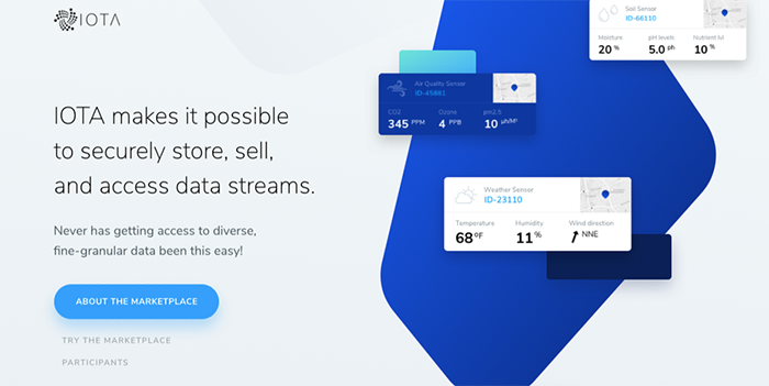
Source: IOTA
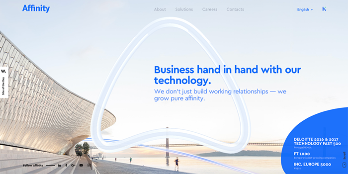
Source: Affinity
While organic shapes are naturally imperfect and asymmetrical, they can provide depth to any website design and highlight different page elements. At the same time, they appear more hand-drawn and humanistic, capturing the spontaneity because of their unusual appearance.
When properly combined with pictures and illustrations, organic shapes can add a nice sense of depth to your site and grab the user’s attention. You can use them to break the monotony of the standard geometric structures and add a personal touch to your website design.
Source: Eddie Lobanovskiy

Source: CrowdRise

Source: Mawla
Micro-animations
The rise of animation was very rapid in the last couple of years and it became one of the most powerful trends in web design. As the animated GIF’s can convey complex ideas in a very short time, being at the same time engaging and entertaining, they became very popular among users and designers.
However, in 2019, animation appears in a smaller dimension, called micro-animations. They are minor movements that show up when your website’s browsers do a specific action, filling your pages with energy and grabbing-attention elements.
As the impact on your website page loading time is minor, they don’t affect the speed of your site and don’t distract your visitors from finding the information they are looking for. In addition, these cute interactions can ad sparkle to your website, while guiding your visitors to do certain actions.
We can include here the use of the subtle, yet lovely cinemagraphs as background or as a part of a larger collection image gallery, or jump into the wonderful world of adding effects to your video.
Whatever solution you adopt, these scaled-down motions will certainly have a dramatic effect on your site's design.

Source: Carlens

Source: Claudio Scotto

Source: KOOX
The rise of brutalism
You like it or not, the present and the future are brutal.
It seems to be something attractive and intriguing about brutalism aesthetic lately because you can see it not just in web design trends, but also in the entire graphic design.
Whether it’s about the natural instinct that pushes away from the “clean”, “lovely” and “minimalist” style that dominated the web design lately, or an incredible resistance to the increasingly surreal blend of reality and fiction we see on the web daily — there’s no denying that brutalism has moved out from design’s subculture into the spotlight.

Source: Squarespace
By default, brutalism is an intersection of multiple trends. The websites that adopt this design feature big typography, web safe colors, massive images, micro-interactions and hover effects, all of them just to overwhelm and impress, without having any specific maximal functionality.
A specific note for the designers: before adopting brutalism as style for your next web design project, remember there are people who find very annoying and disorienting all those frenetic animations filled with dizzying and flashy text, images and colors.
Even if there’s also an accessible side of brutalism, keep in mind that not all the trends are for all people at the same time. So, if you choose to follow this trend, you assume from the beginning your work isn’t for everyone.

Source: Romain Granai
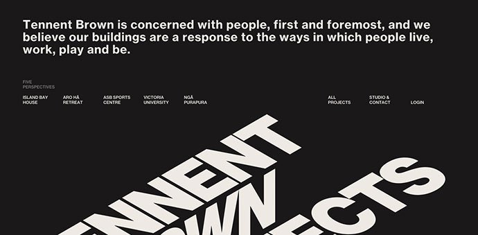
Source: Tennent Brown Architects
Source: Yul Moreau
Chatbots & Machine Learning
Chatbots have been here for a while, but in the last year they became almost a second nature. This is due to the development and evolution of AI and machine learning, making them cuter and more efficient.
As companies strive to offer a better user experience to their visitors, we’ll see chatbots on more and more websites, with a greater personalization than before. Bright colors and even the usage of mascots will make them more noteworthy and inviting.

Source: Insomnobot-3000

Source: MongoDB
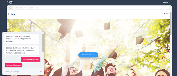
Source: Heek
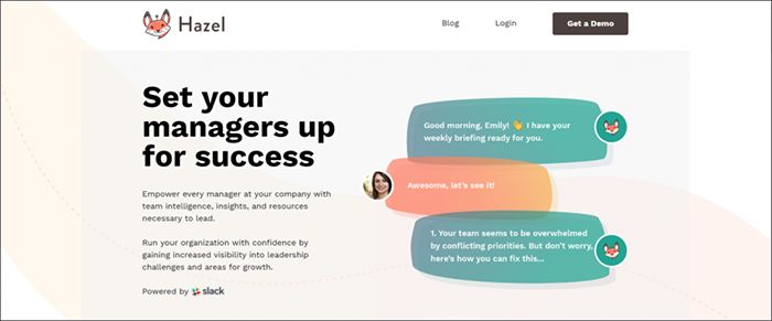
Source: Hazel
Enchanting typography
Bold typefaces have been part of the website design for quite a while now, but in 2019 the designer will step out of the box.
With more artistic versions as ever, fonts can be statements on their own, able to send a specific message, when properly used. A prominent trend is the usage of the unique typography, ranging from the charm of custom hand lettering fonts to the exposure of big and bold strokes, ruined, messy, 3D-filled or cropped types.
All these styles act alone as artistic features, creating accents where you need them. Using several fonts (though not more than three!) on your site allows you to assign a particular aspect of your page. This is just another way the font can help create a visual hierarchy on your website and make it much easier for a user to digest the information.

Source: Vito Salvatore

Source: Nurture Digital
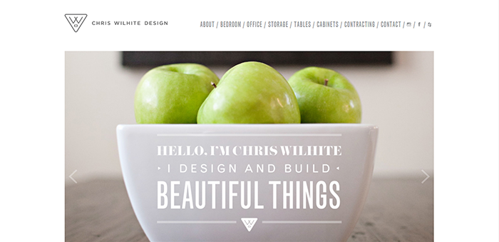
Source: Chris Wilhite Design

Source: La Roulotte Retouche

Source: SFCD
Bottom line
Trends come and go, some of them lasting for decades, while others are just a flame. Staying true to the brand you design for is the most important thing. If something is “on-trend”, you don’t have to adopt it just so.
Even if all of them are interesting and might grab your attention, choose the web design trends that align with the values and messages of your brand.
