Top 10 Graphic Design Trends That Will Shape 2019
It’s that time again when we step back, analyze what happened this year and try to predict what 2019 will bring us. In this very complex world and time, we rapidly move into the future, thanks to powerful innovations in biotechnology, artificial intelligence and blockchain technology.
2018 was the year of creativity, inventiveness and imagination, which were also expressed through chromaticity. The color of the year was Ultra Violet, dubbed by Pantone as a “dramatically provocative and thoughtful purple shade”.
Going further, the 2019 will feature a healthy dose of both nostalgia and futurism for many trends across all industries, with an accent in visual areas such as fashion, product design, interior design, graphic design, illustration and photography.
In this post, I will focus on the graphic design trends, as long as they influence and redefine the way people interact with others as well as with brands.
2019 is the year when the retro influences from brutalism, cubism and abstract arts from the past are reinvented to create a bold and color vision for the digital future. In terms of colors, the start has been given by Pantone (as every year, in fact), who has crowned the color for 2019 as Living Coral, based on its meaning of “innate need for optimism and joyful pursuits" as a response to social media and digital technology.
Leatrice Eiseman, Executive Director of the Pantone Color Institute explains: “Color is an equalizing lens through which we experience our natural and digital realities, and this is particularly true for Living Coral. With consumers craving human interaction and social connection, the humanizing and heartening qualities displayed by the convivial PANTONE Living Coral has a responsive chord”.
Described as an “animating and life-affirming coral hue with a golden undertone”, the vibrant yet mellow hue (Pantone 16-1546 Living Coral) is inspired by two key areas.
First, it is inspired by one of the most diverse biological ecosystems on earth - coral reefs. As the coral reefs provide shelter to a kaleidoscope of colors and support the sea life, Living Coral embraces us with warmth and buoyancy in our continually shifting environment.
Living Coral is also sociable and spirited and encourages the lighthearted activity, representing the fusion of modern life – one that appears in our natural surroundings and, at the same time, displays a lively presence within social media.
That said, let’s take a closer look at the graphic design trends that will influence 2019. Most of them influence both print and web design, but some of them are just for web.
3D Design
Being one of the strongest graphic design trends in 2018, 3D elements seem to be everywhere right now: entire compositions that have so much depth, that they almost make you wanting to feel and touch them. 3D typography especially has a natural look giving you the sense of being ready to pop. The best part? There’s no particular font that works best for this trend: bold, skinny, sans-serif, script, any type can be rendered in 3D.
Beyond typography, we’re seeing a lot of gorgeously rendered 3D compositions that give the impression of coming from distant planets. Some designs, like those listed below, merge these two design trends into futuristic visuals
Source: Issey Miyake
Others seem like they were created from elements directly from the natural world.
In both directions, the effect is stunning—these compositions literally jump right in front of your eyes, making impossible to look away.
Open Compositions
After the domination of the strict order imposed by the boxes and frames, that counted every element and every single visible part of the visuals, designers are more willing to use more open compositions. These are designs where you feel like you see just a part of the whole picture, letting at the same time an entire world out of the page.
These compositions embrace white space and avoid clear hierarchy. The designers can easily play with the visual elements and mix them in a literally infinite composition. This trend is easily achieved in web design but it is possible even on print design.
Isometric design
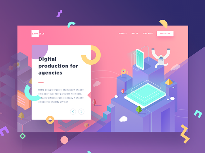
While open compositions create the feeling of leaving a part of the world out, isometric designs create a whole universe in tiny little spaces. Isometric design sounds highly technical, but it’s simply a method of drawing a 3D object in two dimensions. The visuals are simple and clean, having at the same time a depth that flat design can’t compete with.
We’ve seen this trend before, but for sure it’s here to stay, especially because Isometric designs have more tactility and warmth than flat design. Plus they are saved to a smaller file size than 3D!
More refined gradients
The gradients (or color transitions – as we used to call them) are one of the biggest design trends right now. Started in 2016 and rising quickly after, this tendency is everywhere, from logo to buttons or picture overlays. As some of the large brands decided to change their visuals from flat color to multi-colored transitions, is no surprise that this trend has continued to evolve. But in 2019, the gradients are more refined, effectively adapt to other trends and are combined with them.
At the same time, we saw in the past year a „return of the duo tone”. The two parallel trends have combined, so many experts predict that 2019 will be the year of the duotone gradient.
Asymmetrical layouts
Asymmetrical designs are not exactly new, but since last year, we've started to see a more predominant move away from rigid grid-based designs that have been standard for the past few years and the desire of the designers to create visuals that feel more bespoke and alive.
Because these designs break out of the rigid and predictable grid, they provide more energy and kinetic motion. An asymmetrical layout whether it is used in a print design, in an app or on a site, requires attention. The user feels an inherent curiosity about where the information and the graphics might go, creating a sense of wonder and interest while scrolling or taking a closer look to a design.
Retro-modern illustration
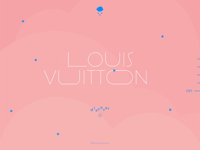
Even if we have seen custom illustrations for a while, this trend has an interesting twist. As a direct response to the Art Deco period, designers decided that the function should dictate the shape, and adopt simple and clean lines, while moving away from the flashy and complicated designs. In recent years, retro influence has been noticeably visible in areas such as interior design and fashion, while it has been a steadily growing trend in graphic design.
Many brands are recognizing the power of custom illustrations and we can see this kind of visuals almost everywhere: on websites, print design, packaging and even apps. Most often, they are packed in a clearly modern style but retaining dreamy vintage color palettes. In 2019 is expected to see these continue to dominate web and in print work as well.
Custom illustrations
Every design is a piece of art created with talent and imagination that reinforces the message sent to the audience. That’s why using illustrations is a trend that will never go out of style.
When it comes to graphic design, illustrations bring a special vibe and more personality than the stock photography. This is one of the best ways for adding a visual appeal to any design and for creating unique visuals for any brand.
In 2018 illustrations were presented in combination with other graphic design trends such as negative space, 3D structures, combined with digital drawing and more. All these techniques boost the effect of the illustrations and bring the composition a new edgy look.
But in 2019, we’ll see more delicate and elegant illustrations. Being influenced by natural elements, these visuals are more feminine and appeal to a more innocent and childlike part of us all. We’ll see them especially in packaging design, where intricate designs are displayed beautifully on a textured paper background. With addition of premium materials like foil and embossing, these designs give a balance between maximalism and simplicity.
Bookman & Oldstyle Serifs
Remaining at the same idea of the influence of retro style in modern design, we can see a reinforce of the classic fonts. Sans-serif typeface is the font used by the nearly every global company and many brands are now bringing back some emotion in the form of personality-packed serif typefaces, often in Bookman, Oldstyle or transitional styles.
Antigravity – flying and floating elements
Flying and floating elements in visuals are not new, but they are here to stay, being among the top graphic design trends in 2019. The idea of designs which move and behave like they are in a non-gravity environment conveys the overall feeling of freedom and depth. Designed with an open composition in mind, these elements boost the major concept of a window to a new world, as they appear floating in and out of the screen.
This technique is often mixed with the non-gravity concept which adds realism to the composition. While 3D is certainly a field to unleash the designer’s creativity, then the non-gravity concept definitely enhances composition even more.
Design by Ben Fearnley
We also see the antigravity trend in packaging presentations, giving the product the feeling that it comes from a different world. The viewer can easily feel the futuristic vibes when looking at these products, which naturally increase curiosity. As a result, an ordinary product easily turns into an extraordinary one. Anti-gravity is a concept that definitely will shape the graphic design trends in 2019.
Bold and vibrant colors
With so many graphic design trends fighting for the leading positions in 2019, bright colors are certainly on top. This direction has stared earlier in 2016 through a variety of design elements and continued to grow in 2018, becoming more vivid. As they bring a futuristic feeling to the overall design, these bright colors, combined with courageous color schemes, gradients and 3D designs will make you feel like you are in an alternative universe.
As an addition to bright colors, metallic elements are used to create the “wow” effect. Often combined with other hot directions such as 3D compositions and creative typography golden and other metallic elements take the whole visual to the next level, making it look expensive and exclusive.
Packaging design will also be influenced by the metallic elements, especially golden and iridescent. The classic combination remains metallic on black and white but in 2019 we will be seeing a lot of golden on a backdrop of pastel colors, giving it a sense of luxury and exclusivity.
Final Words:
If I would describe graphic design trends 2019 in three words, these would be – anything but boring. Anyway, you should keep in mind this isn’t an exhaustive list and there are plenty of other trends that may come up or drown this year. All you need to do is make sure you look out for them and apply the ones that fit you best.


